출처: https://www.tensorflow.org/tutorials/images/classification?hl=ko
텐서프로를 이용해서 꽃 이미지를 분류해볼 것이다. keras.Sequential 모델을 사용하여 image classifier를 만들고 preprocessing.image_dataset_from_directory를 사용하여 데이터를 로드한다.
다음과 같은 기본적인 머신러닝 워크플로를 따른다.
- 데이터 검사 및 이해하기
- 입력 파이프라인 빌드하기
- 모델 빌드하기
- 모델 훈련하기
- 모델 테스트하기
- 모델을 개선하고 프로세스 반복하기
TensorFlow 및 기타 라이브러리 가져오기
import matplotlib.pyplot as plt
import numpy as np
import os
import PIL
import tensorflow as tf

from tensorflow import keras
from tensorflow.keras import layers
from tensorflow.keras.models import Sequential
데이터세트 다운로드 및 탐색하기
이 튜토리얼에서는 약 3700장의 꽃 사진의 데이터셋을 사용하고, 클래스당 하나씩 5개의 하위 디렉토리가 있다.
flower_photo/
daisy/
dandelion/
roses/
sunflowers/
tulips/
import pathlib
dataset_url = "https://storage.googleapis.com/download.tensorflow.org/example_images/flower_photos.tgz"
data_dir = tf.keras.utils.get_file('flower_photos', origin=dataset_url, untar=True)
data_dir = pathlib.Path(data_dir)
데이터를 모두 다운로드 했다. 데이터셋의 사본을 사용할 수 있다.
image_count = len(list(data_dir.glob('*/*.jpg')))
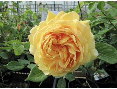
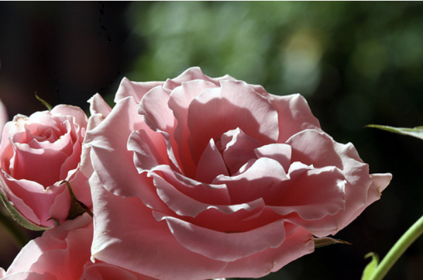
print(image_count) #총 3670개의 이미지가 있다.roses = list(data_dir.glob('roses/*'))
PIL.Image.open(str(roses[0]))
PIL.Image.open(str(roses[1]))실행 결과 장미의 이미지를 볼 수 있다.
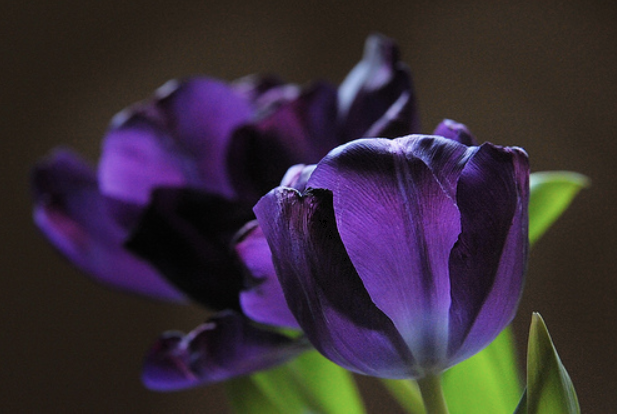
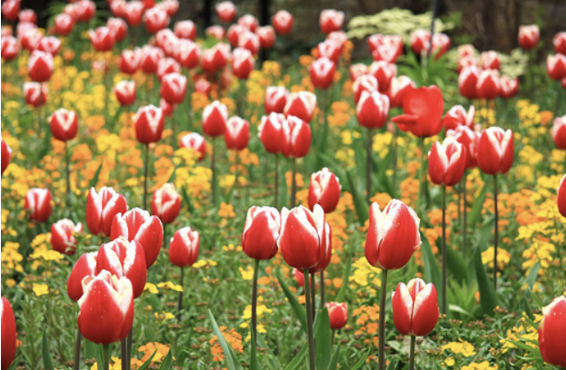
tulips = list(data_dir.glob('tulips/*'))
PIL.Image.open(str(tulips[0]))
PIL.Image.open(str(tulips[1]))
튤립의 경우도 마찬가지
keras.preprocessing을 사용하여 로드하기
데이터셋 만들기
batch_size = 32
img_height = 180
img_width = 180

train_ds = tf.keras.preprocessing.image_dataset_from_directory(
  data_dir,
  validation_split=0.2, #training:validation set의 비율이 80:20
  subset="training",
  seed=123,
  image_size=(img_height, img_width),
  batch_size=batch_size)

  # 실행 결과
  # Found 3670 files belonging to 5 classes.
  # Using 2936 files for training.
val_ds = tf.keras.preprocessing.image_dataset_from_directory(
data_dir,
validation_split=0.2,
subset="validation",
seed=123,
image_size=(img_height, img_width),
batch_size=batch_size)
# 실행결과
# Found 3670 files belonging to 5 classes.
# Using 734 files for validation.
class_names = train_ds.class_names
# 데이터셋의 클래스 이름을 class_names에 저장한다. 알파벳 순서의 디렉토리 이름에 해당한다.
print(class_names)

# 실행결과
# ['daisy', 'dandelion', 'roses', 'sunflowers', 'tulips']
데이터 시각화하기
# 훈련 데이터셋의 처음 9개의 이미지 시각화하기
import matplotlib.pyplot as plt

plt.figure(figsize=(10, 10))
for images, labels in train_ds.take(1):
  for i in range(9):
    ax = plt.subplot(3, 3, i + 1)
    plt.imshow(images[i].numpy().astype("uint8"))
    plt.title(class_names[labels[i]])
    plt.axis("off")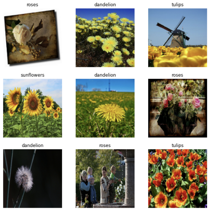
for image_batch, labels_batch in train_ds:
  print(image_batch.shape)
  print(labels_batch.shape)
  break

# 실행 결과
# (32, 180, 180, 3)
# (32,)
image_batch는 (32, 180, 180, 3) shape의 텐서이며, 180x180x3 shape의 32개 이미지 묶음으로 되어 있다(마지막 차원은 색상 채널 RGB를 나타냄). label_batch는 shape (32,)의 텐서이며 32개 이미지에 해당하는 레이블이다.
성능을 높이도록 데이터셋 구성하기
버퍼링된 프리페치를 사용하여 I/O를 차단하지 않고 디스크에서 데이터를 생성할 수 있도록 하겠다. 데이터를 로드할 때 다음 두 가지 중요한 메서드를 사용해야 한다.
- Dataset.cache()는 첫 epoch 동안 디스크에서 이미지를 로드한 후 이미지를 메모리에 유지한다. 이렇게 하면 모델을 훈련하는 동안 데이터세트가 병목 상태가 되지 않는다.
- Dataset.prefetch()는 훈련 중에 데이터 전처리 및 모델 실행과 겹친다.
(-->>이게 무슨말이지??)
AUTOTUNE = tf.data.experimental.AUTOTUNE

train_ds = train_ds.cache().shuffle(1000).prefetch(buffer_size=AUTOTUNE)
val_ds = val_ds.cache().prefetch(buffer_size=AUTOTUNE)
데이터 표준화하기
RGB 채널 값은 [0, 255] 범위에 있다. 신경망에는 이상적이지 않다. 일반적으로 입력 값을 작게 만들어야 한다. 여기서는 Rescaling 레이어를 사용하여 값이 [0, 1]에 있도록 표준화한다.
normalization_layer = layers.experimental.preprocessing.Rescaling(1./255)이 레이어를 사용하는 방법에는 두 가지가 있다.
- map을 호출하여 데이터세트에 레이어를 적용할 수 있다.
normalized_ds = train_ds.map(lambda x, y: (normalization_layer(x), y))
image_batch, labels_batch = next(iter(normalized_ds))
first_image = image_batch[0]
# Notice the pixels values are now in `[0,1]`.
print(np.min(first_image), np.max(first_image))

# 실행결과
# 0.0 0.9791725
2. 모델 def 내에 레이어를 포함하여 배포를 단순화할 수 있다. 여기서는 두 번째 접근법을 사용할 것이다.
모델 만들기
모델은 각각에 최대 풀 레이어가 있는 3개의 컨볼루션 블록으로 구성된다. 그 위에 relu 활성화 함수에 의해 활성화되는 128개의 단위가 있는 완전히 연결된 레이어가 있다.
num_classes = 5

model = Sequential([
  layers.experimental.preprocessing.Rescaling(1./255, input_shape=(img_height, img_width, 3)),
  layers.Conv2D(16, 3, padding='same', activation='relu'),
  layers.MaxPooling2D(),
  layers.Conv2D(32, 3, padding='same', activation='relu'),
  layers.MaxPooling2D(),
  layers.Conv2D(64, 3, padding='same', activation='relu'),
  layers.MaxPooling2D(),
  layers.Flatten(),
  layers.Dense(128, activation='relu'),
  layers.Dense(num_classes)
])
모델 컴파일하기
이 튜토리얼에서는 optimizers.Adam 옵티마이저 및 losses.SparseCategoricalCrossentropy 손실 함수를 이용한다.
model.compile(optimizer='adam',
              loss=tf.keras.losses.SparseCategoricalCrossentropy(from_logits=True),
              metrics=['accuracy'])
모델 요약
model.summary()
# summary() 메소드를 사용하여 네트워크의 모든 레이어를 볼 수 있다.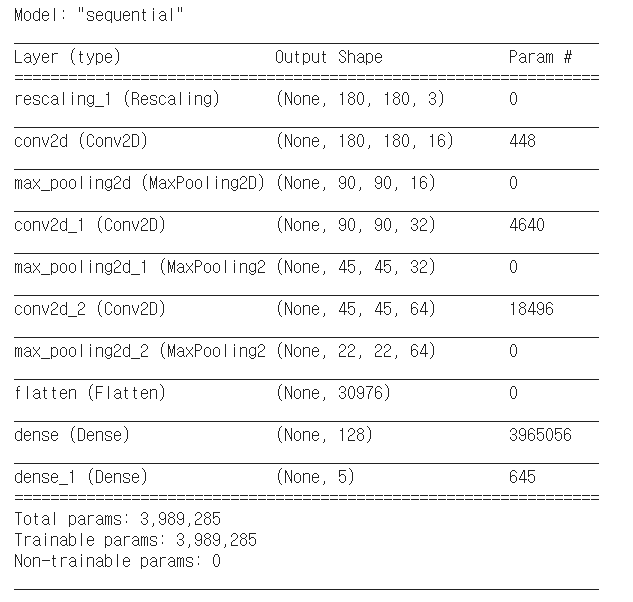
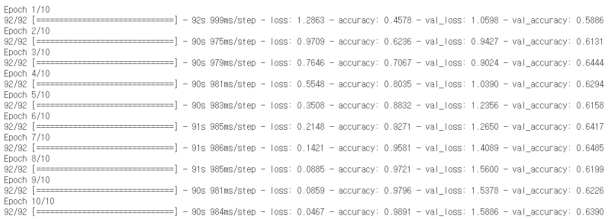
모델 훈련시키기
epochs=10
history = model.fit(
  train_ds,
  validation_data=val_ds,
  epochs=epochs
)
훈련 결과 시각화하기
acc = history.history['accuracy']
val_acc = history.history['val_accuracy']

loss=history.history['loss']
val_loss=history.history['val_loss']

epochs_range = range(epochs)

plt.figure(figsize=(8, 8))
plt.subplot(1, 2, 1)
plt.plot(epochs_range, acc, label='Training Accuracy')
plt.plot(epochs_range, val_acc, label='Validation Accuracy')
plt.legend(loc='lower right')
plt.title('Training and Validation Accuracy')

plt.subplot(1, 2, 2)
plt.plot(epochs_range, loss, label='Training Loss')
plt.plot(epochs_range, val_loss, label='Validation Loss')
plt.legend(loc='upper right')
plt.title('Training and Validation Loss')
plt.show()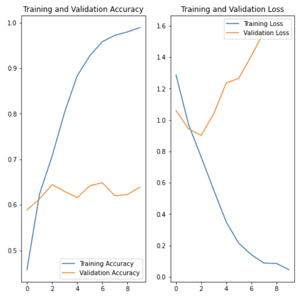
OVERFITTING 과대적합
위의 플롯에서 훈련 정확성은 시간이 지남에 따라 선형적으로 증가하는 반면, 검증 정확성은 훈련 과정에서 약 60%를 벗어나지 못한다. 또한 훈련 정확성과 검증 정확성 간의 정확성 차이가 상당한데, 이는 과대적합의 징후이다.
훈련 예제가 적을 때 모델은 새로운 예제에서 모델의 성능에 부정적인 영향을 미치는 정도까지 훈련 예제의 노이즈나 원치 않는 세부까지 학습한다. 이 현상을 과대적합이라고 한다. 이는 모델이 새 데이터세트에서 일반화하는 데 어려움이 있음을 의미한다.
훈련 과정에서 과대적합을 막는 여러 가지 방법들이 있다. 이 튜토리얼에서는 데이터 증강을 사용하고 모델에 드롭아웃을 추가한다.
데이터 증강(data augmentation)
과대적합은 일반적으로 훈련 예제가 적을 때 발생한다. 데이터 증강은 증강한 다음 믿을 수 있는 이미지를 생성하는 임의 변환을 사용하는 방법으로 기존 예제에서 추가 훈련 데이터를 생성하는 접근법을 취한다. 그러면 모델이 데이터의 더 많은 측면을 파악하게 되므로 일반화가 더 쉬워진다.
여기서는 Keras 전처리 레이어를 사용하여 데이터 증강을 구현한다. 이들 레이어는 다른 레이어와 마찬가지로 모델 내에 포함될 수 있으며, GPU에서 실행된다.
data_augmentation = keras.Sequential(
  [
    layers.experimental.preprocessing.RandomFlip("horizontal",
                                                 input_shape=(img_height,
                                                              img_width,
                                                              3)),
    layers.experimental.preprocessing.RandomRotation(0.1),
    layers.experimental.preprocessing.RandomZoom(0.1),
  ]
)
plt.figure(figsize=(10, 10))
for images, _ in train_ds.take(1):
for i in range(9):
augmented_images = data_augmentation(images)
ax = plt.subplot(3, 3, i + 1)
plt.imshow(augmented_images[0].numpy().astype("uint8"))
plt.axis("off")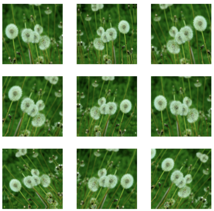
드롭아웃
과대적합을 줄이는 또 다른 기술은 정규화의 한 형태인 드롭아웃을 네트워크에 도입하는 것이다. 드롭아웃을 레이어에 적용하면, 훈련 프로세스 중에 레이어에서 여러 출력 단위가 무작위로 드롭아웃된다(활성화를 0으로 설정). 드롭아웃은 0.1, 0.2, 0.4 등의 형식으로 소수를 입력 값으로 사용한다. 이는 적용된 레이어에서 출력 단위의 10%, 20% 또는 40%를 임의로 제거하는 것을 의미한다. layers.Dropout을 사용하여 새로운 신경망을 생성한 다음, 증강 이미지를 사용하여 훈련해 보겠다.
model = Sequential([
  data_augmentation,
  layers.experimental.preprocessing.Rescaling(1./255),
  layers.Conv2D(16, 3, padding='same', activation='relu'),
  layers.MaxPooling2D(),
  layers.Conv2D(32, 3, padding='same', activation='relu'),
  layers.MaxPooling2D(),
  layers.Conv2D(64, 3, padding='same', activation='relu'),
  layers.MaxPooling2D(),
  layers.Dropout(0.2),
  layers.Flatten(),
  layers.Dense(128, activation='relu'),
  layers.Dense(num_classes)
])
모델 컴파일 및 훈련하기
model.compile(optimizer='adam',
              loss=tf.keras.losses.SparseCategoricalCrossentropy(from_logits=True),
              metrics=['accuracy'])

model.summary()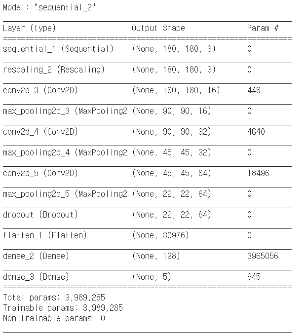
epochs = 15
history = model.fit(
  train_ds,
  validation_data=val_ds,
  epochs=epochs
)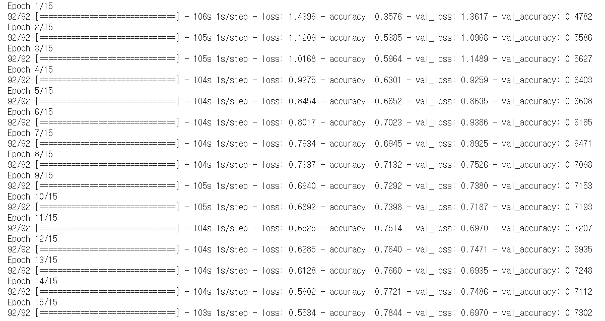
Training 결과 시각화하기
데이터 증강 및 드롭아웃을 적용한 후, 이전보다 과대적합이 줄어들고 훈련 및 검증 정확성이 더 가깝게 조정된다.
acc = history.history['accuracy']
val_acc = history.history['val_accuracy']

loss = history.history['loss']
val_loss = history.history['val_loss']

epochs_range = range(epochs)

plt.figure(figsize=(8, 8))
plt.subplot(1, 2, 1)
plt.plot(epochs_range, acc, label='Training Accuracy')
plt.plot(epochs_range, val_acc, label='Validation Accuracy')
plt.legend(loc='lower right')
plt.title('Training and Validation Accuracy')

plt.subplot(1, 2, 2)
plt.plot(epochs_range, loss, label='Training Loss')
plt.plot(epochs_range, val_loss, label='Validation Loss')
plt.legend(loc='upper right')
plt.title('Training and Validation Loss')
plt.show()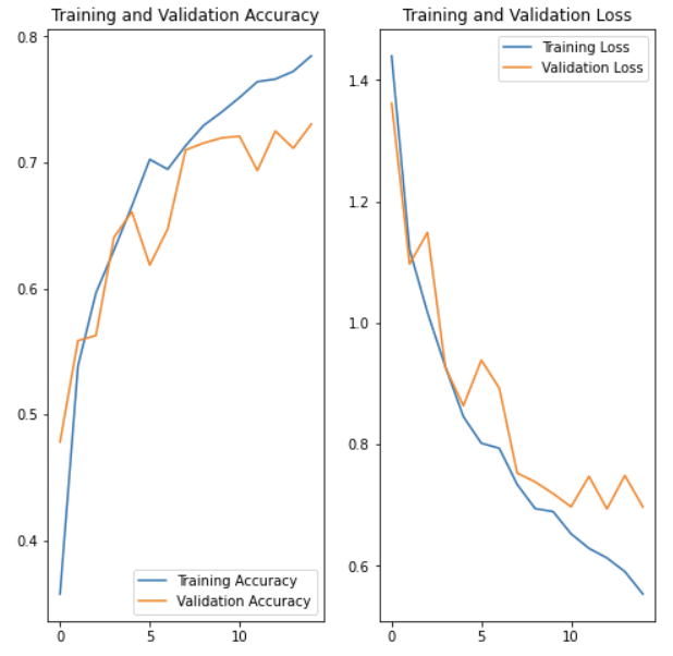
새로운 데이터로 예측하기
마지막으로 모델을 사용하여 test set에 대해 이미지를 분류해보겠다. 데이터 증강 및 드롭아웃 레이어는 이때 비활성된다.
sunflower_url = "https://storage.googleapis.com/download.tensorflow.org/example_images/592px-Red_sunflower.jpg"
sunflower_path = tf.keras.utils.get_file('Red_sunflower', origin=sunflower_url)

img = keras.preprocessing.image.load_img(
    sunflower_path, target_size=(img_height, img_width)
)
img_array = keras.preprocessing.image.img_to_array(img)
img_array = tf.expand_dims(img_array, 0) # Create a batch

predictions = model.predict(img_array)
score = tf.nn.softmax(predictions[0])

print(
    "This image most likely belongs to {} with a {:.2f} percent confidence."
    .format(class_names[np.argmax(score)], 100 * np.max(score))
)
실행결과
This image most likely belongs to sunflowers with a 86.66 percent confidence.
굳!